Poster clinic: Simple design is best
Part 3 in a series
 Now that you have your text ready, it is time to work on the design of the poster. This can be done in many ways. Most people will start from a template they found online or provided by their institution. These are very handy if you don’t have much time or little design skills. But since almost everyone is using very similar templates, you see that posters often look alike.
For example, as you see in this picture, most posters tend to be in blue and white. Although this is a very quiet color combination that makes for comfortable viewing, it does not help attract the reader’s attention the same way green or warm color accents might have done.
Another issue is that templates tend to be organized into columns, which are very inviting to fill with text. If you use a template, make sure to avoid columns and work with smaller blocks of text instead. These also give you much more freedom to adapt the design to the specific needs of your message.
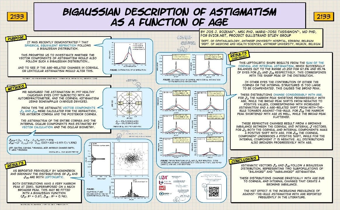
Personally, I start by choosing an essential figure and putting it in large format in a very central position and building everything around that. Next, put the different text sections (Purpose, Methods, Results, Discussion, take-home message) in separate boxes and place them in logical positions around the central figure. Make sure each box is titled, numbered and has a similar design (e.g. same color and width) to ensure the reader immediately understands how to navigate your poster. Using such boxes will allow you much more freedom in your design. Once the boxes are roughly where you want them to be, add the title and other elements (bibliography, extra information). At this point you should have a rough idea of the layout, although the shape and positions of the objects may still change.
Now it is time for the artistic part. In this area I cannot guide you too much, that is up to your inner artist, but here are some guidelines:
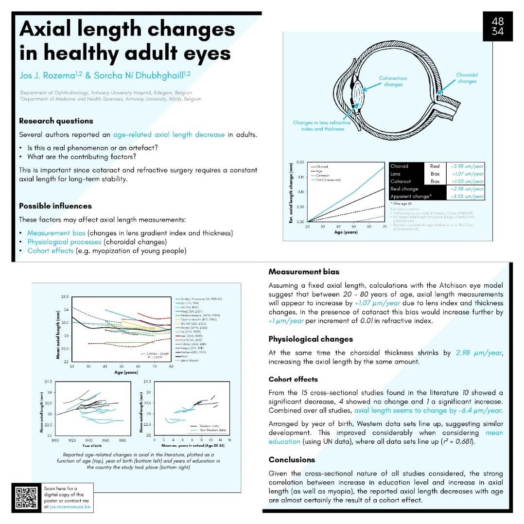
- Color is a very powerful way to attract attention and should be used sparingly. Limit the number of different colors on your poster and work with complementary colors. The combination of greyscale and accent colors work great as well.
- Choose a different design for poster elements according to their content (e.g. text boxes are square and red, extra information grey, etc.) to indicate their relative importance.
- Think about colorblind readers. To those with red-green color blindness (about 5% of the population) blue-green and magenta-violet will appear grey and indistinguishable from one another. For your convenience, here is a simulation of how they experience colors.
- Make sure the text contrasts strongly from the background for easy reading. Avoid using text with a textured background.
- Use a maximum of two font types that are easy to read, such as sans serif fonts (e.g. Arial, Calibri, Verdana, etc.). Never use Comic Sans!
- Ensure that the figures have a sufficiently high resolution to avoid pixelated images. It is preferred to use vector graphics (e.g. Excel graphs imported into PowerPoint).
- Verify that all the design elements (text blocks, figure blocks, etc.) are aligned with each other. Most software packages have automated tools for this purpose.
- Make sure font sizes are large enough to read comfortably from a discrete distance. Important text should never be smaller than 28 pt.
- Do not use the logos of entities you are not associated with, such as ARVO or companies, to avoid giving the impression that they endorse your work.
- Instead of classic handouts, add a QR code linking to a pdf version of the poster. There are plenty of great websites that let you make a QR code for free. Use a link shortener such as Bit.ly to avoid having to add a large, complex looking block to your poster.
Here are a few of my old ARVO posters based on these principles for inspiration:


Jos J. Rozema, MSc, PhD

